Work
Work
Sandbox
Sandbox
About Me
About Me
Resume
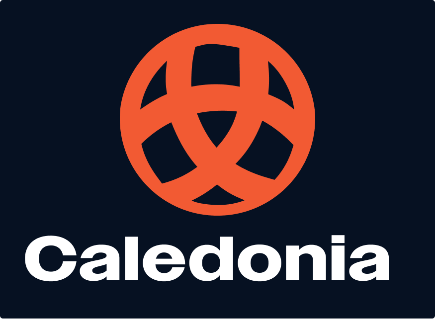
Caledonia Design System
View Full UI Kit


Overview
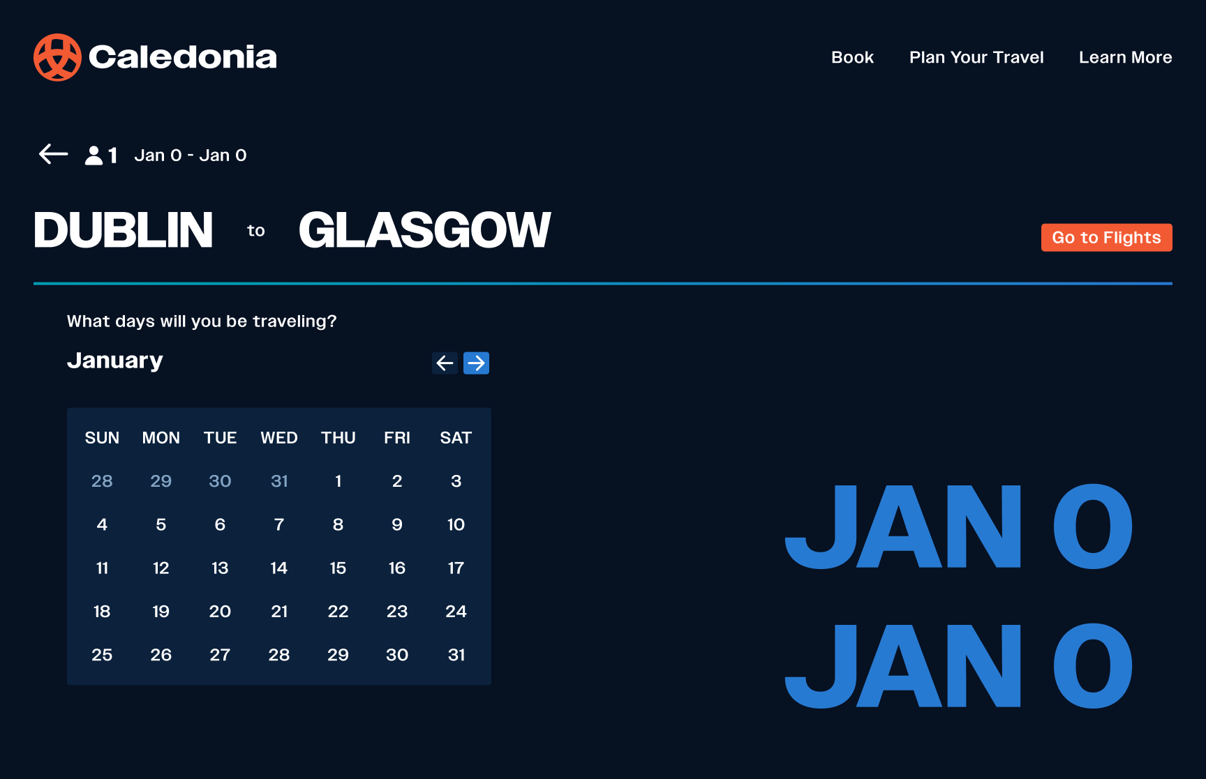
Streamlining the travel booking experience
Background
Caledonia Airline needed a cohesive visual identity and design system that could streamline the travel booking experience while reflecting the brand’s cultural heritage. The existing experience felt fragmented, inconsistent across platforms, and lacked the clarity modern travelers expect. This project focused on developing a unified system that is intuitive, scalable, and grounded in the visual language of Scotland.
Timeline
3 Months
Tools
- Figma
- Claude
- Figma Make
Deliverables
- Figma Design System Kit
- Airline Website
- Design System Website
Opportunity
Travelers often face confusion when booking flights due to cluttered interfaces, unclear hierarchy, and a lack of consistent navigation patterns. Caledonia Airline had the chance to modernize its digital presence by rethinking the entire user journey, improving efficiency, trust, and visual cohesion across all touchpoints.
Solution
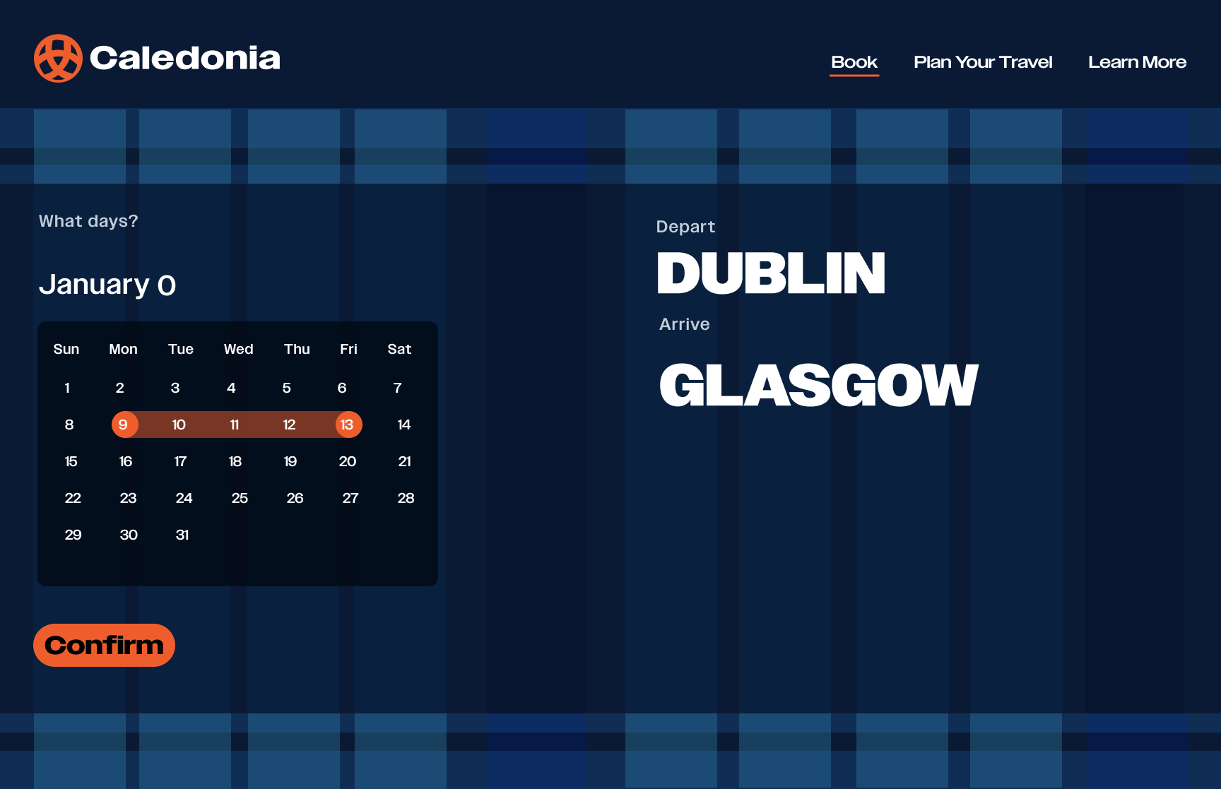
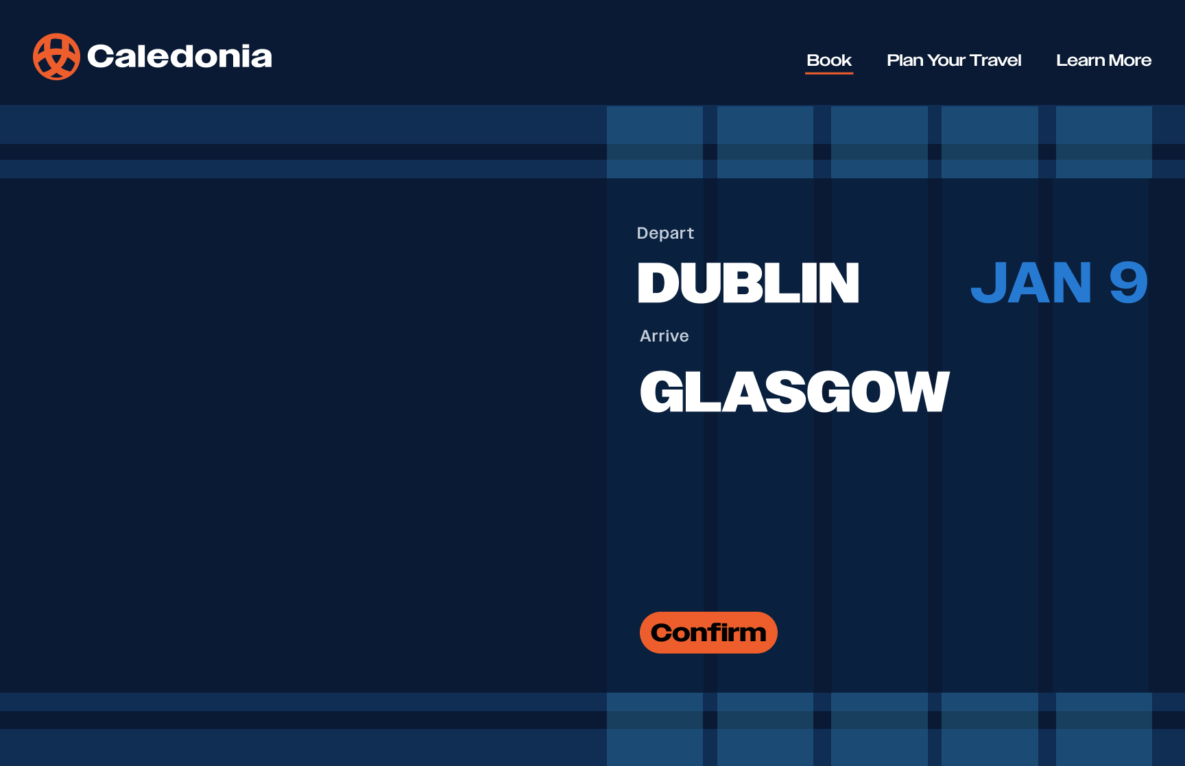
I created a comprehensive design system built around clarity, cultural identity, and streamlined interaction patterns. Drawing inspiration from Scottish tartans and Celtic knots, the system blends tradition with modern UI principles. The final solution includes a unified typography set, component library, color system, and responsive layouts that create a smooth and intuitive booking flow from start to finish.
Goals
Streamline the booking process
Create a detailed, scalable design system
Learn advanced prototyping in Figma
Research
Airline Design
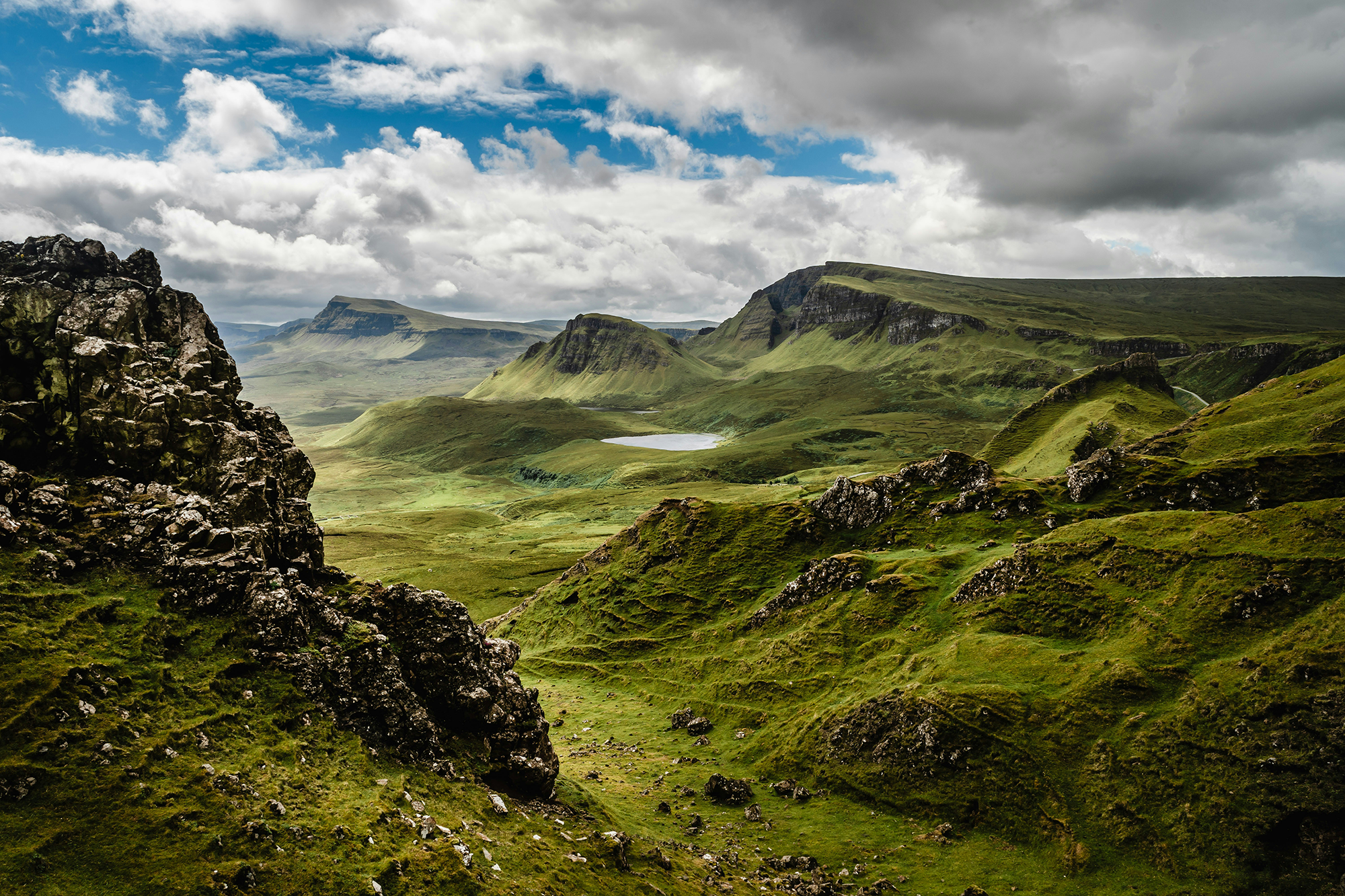
Creating a visual identity for a Scotland based airline
To begin the process for this airline I had to consider both the user experience design as well as the branding. I researched well-known airline booking sites as well as historical and cultural significance of Scotland where the airline is based.
Design Inspiration
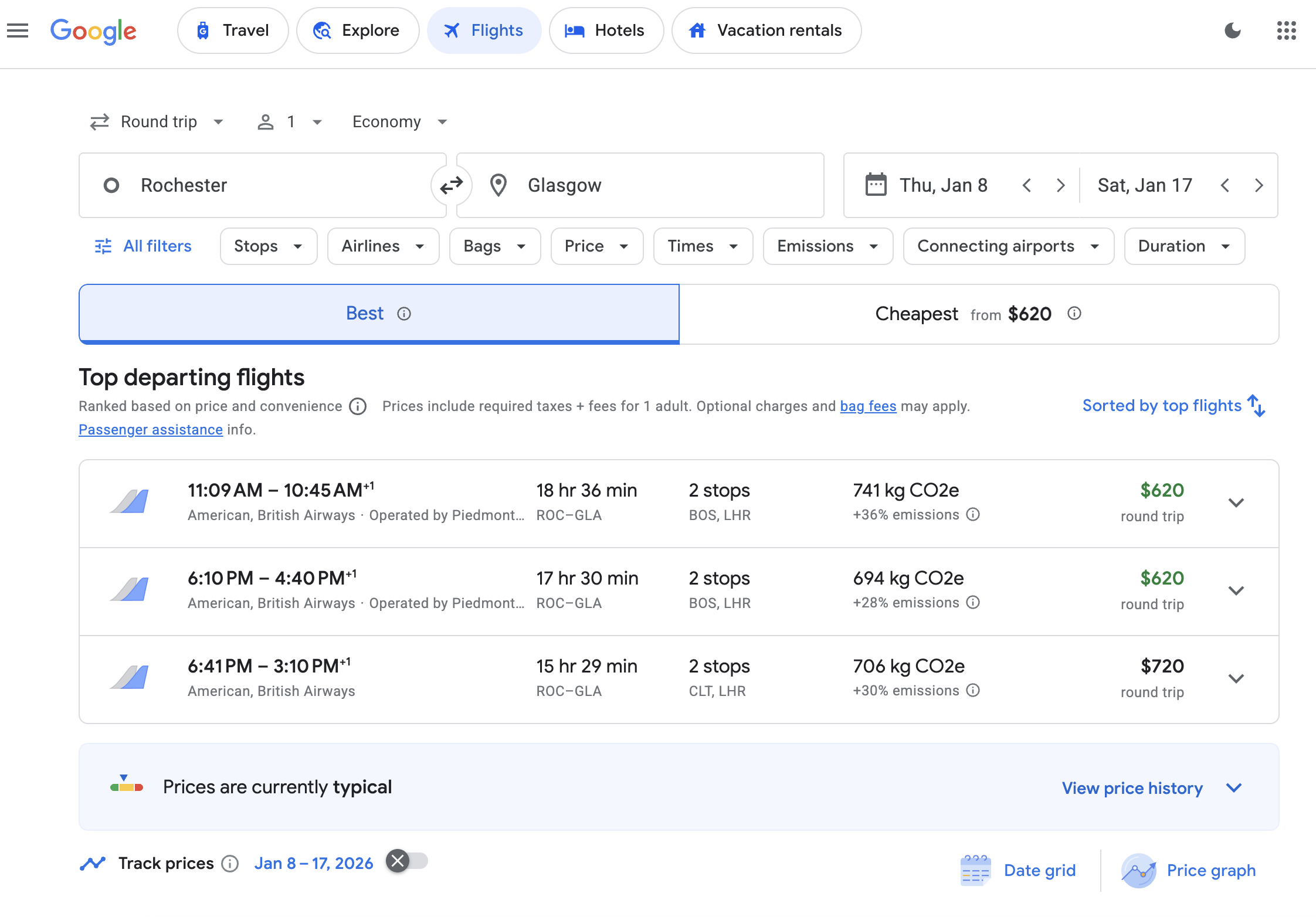
Google Flights
Its clean layout, powerful filters, and clear information hierarchy inspired me to prioritize simplicity and quick decision-making in the booking flow.
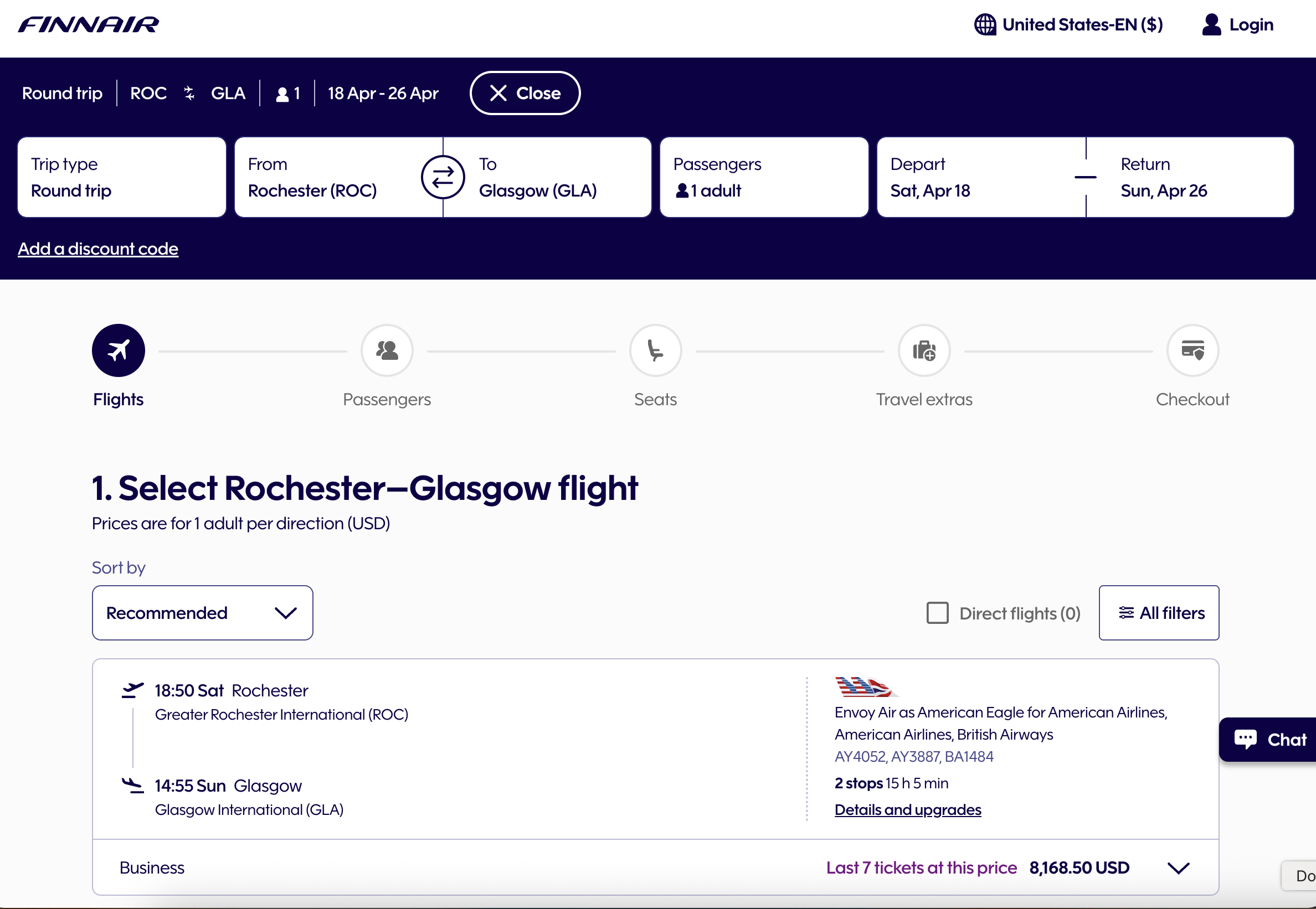
Finnair
Finnair’s calm, minimalist aesthetic and strong use of white space influenced my approach to creating a modern, breathable interface.
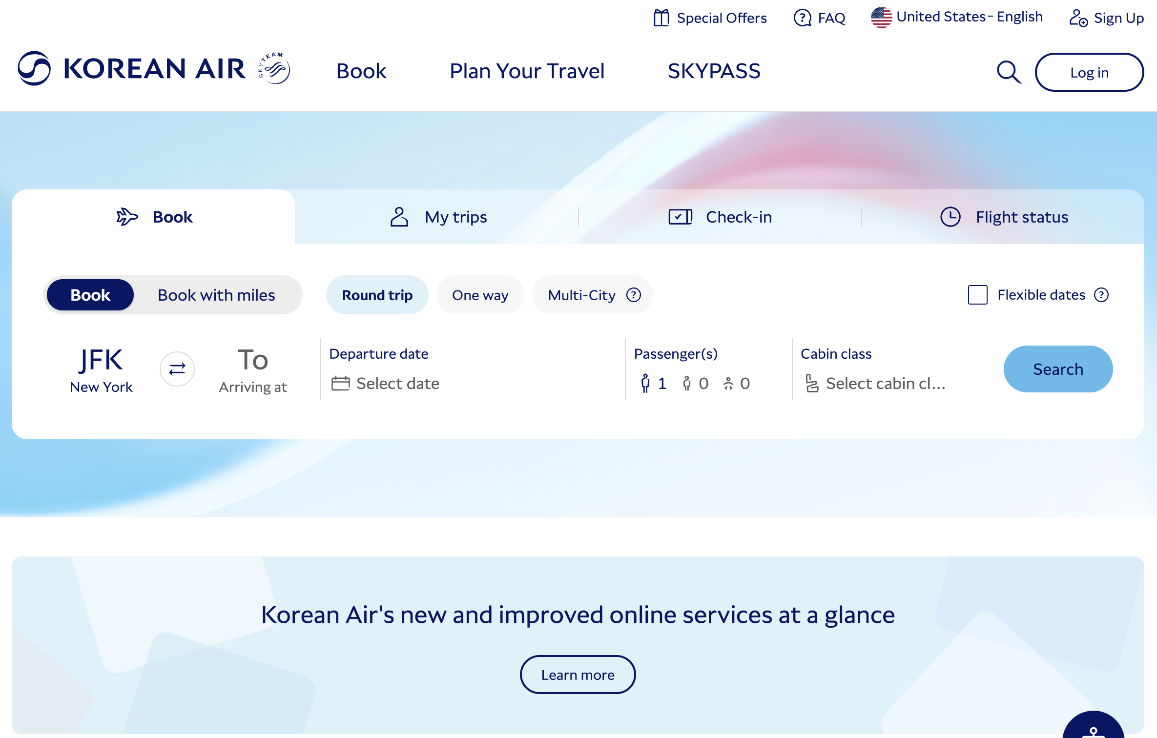
Korean Air
Korean Air’s bold branding and structured layouts guided my decisions on maintaining clarity while integrating a culturally distinctive visual identity.
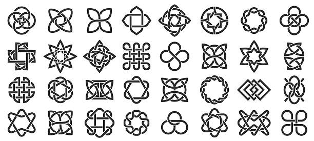
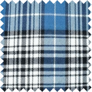
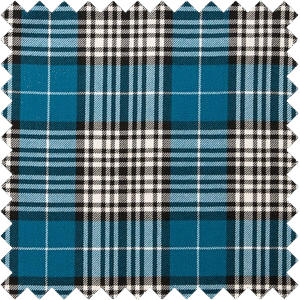
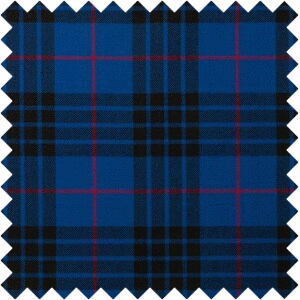
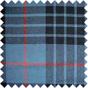
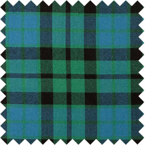
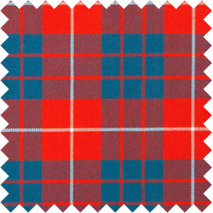
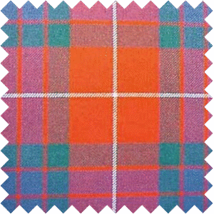
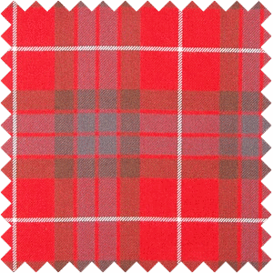
Cultural Significance
Scottish Tartans and Celtic Knots
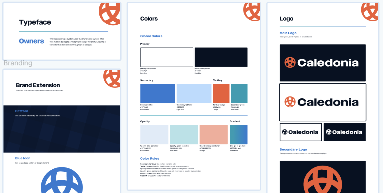
Tartan connects naturally to an airline rooted in Glasgow by expressing Scottish heritage and giving Caledonia Air an immediate sense of place and identity. Using it in the branding helps travellers feel a cultural connection from the moment they interact with the airline, creating a distinctive and welcoming brand experience.
Design Process
Starting to Design
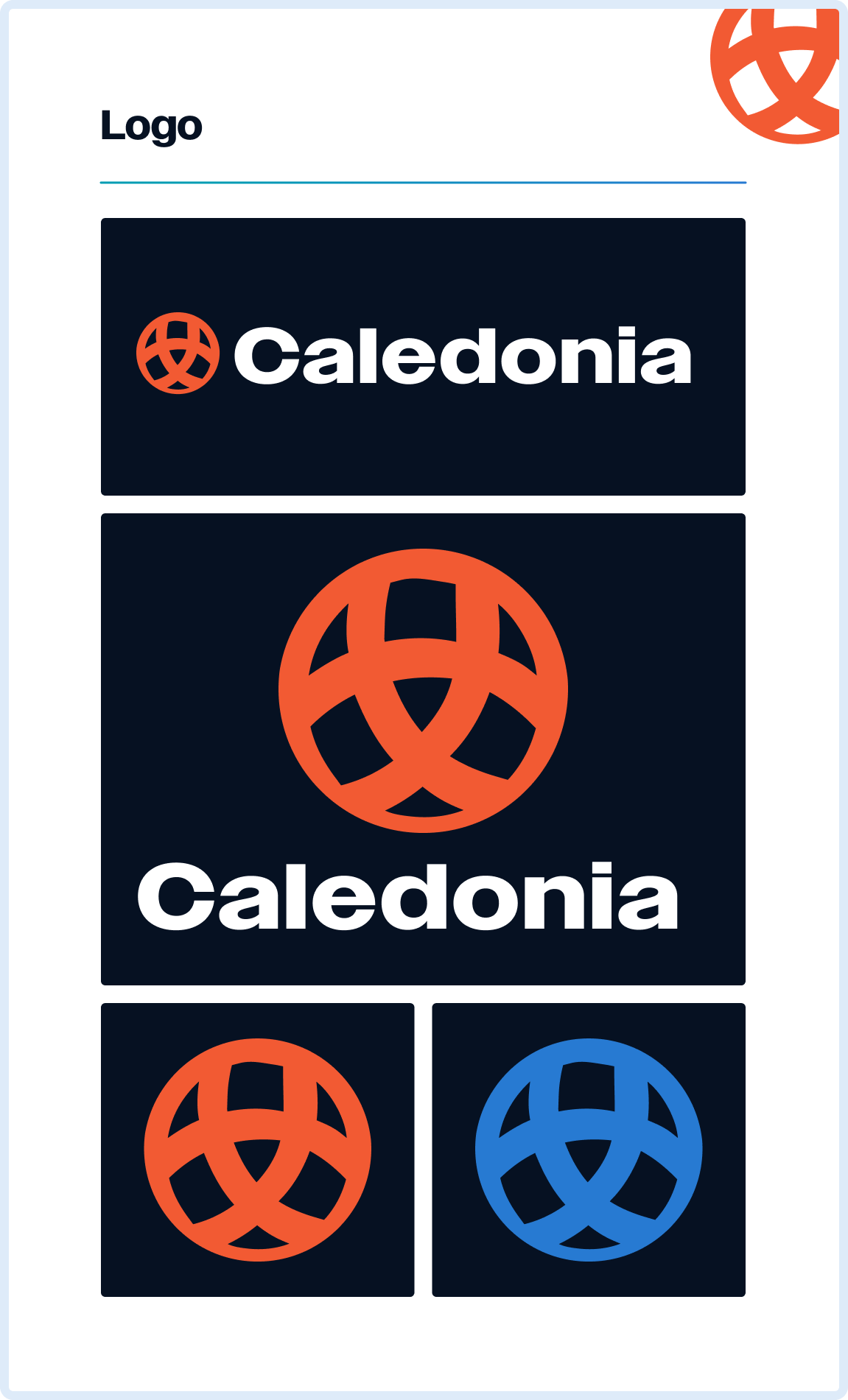
Meaning behind the “Orb”
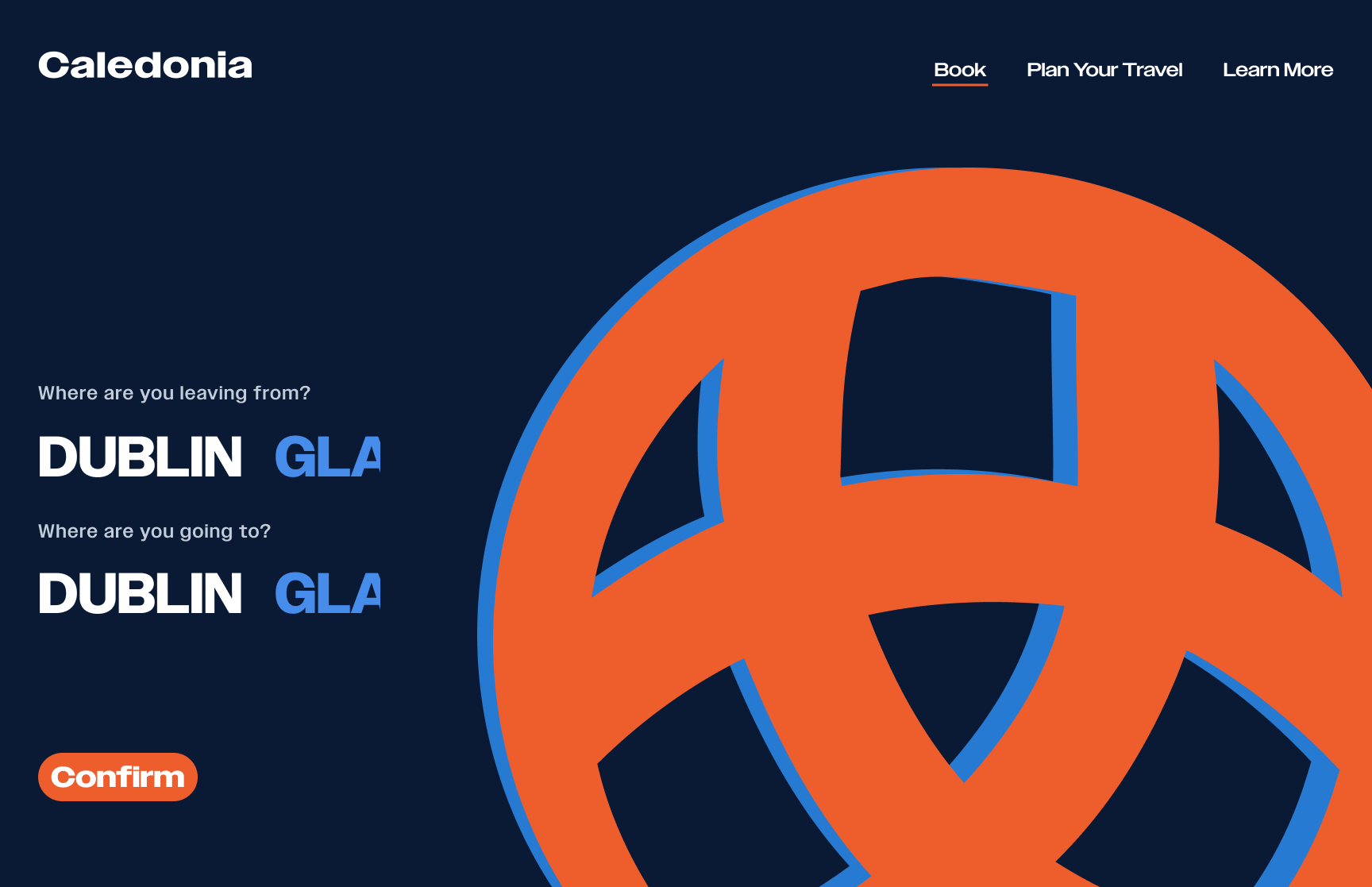
The circular form and intertwined lines of the logo visually communicate Caledonia Air’s core purpose: creating seamless connections between destinations. This knot-inspired structure also reflects the airline’s role in bringing people together, weaving individual journeys into a unified network of shared travel experiences.

Planning the Routes
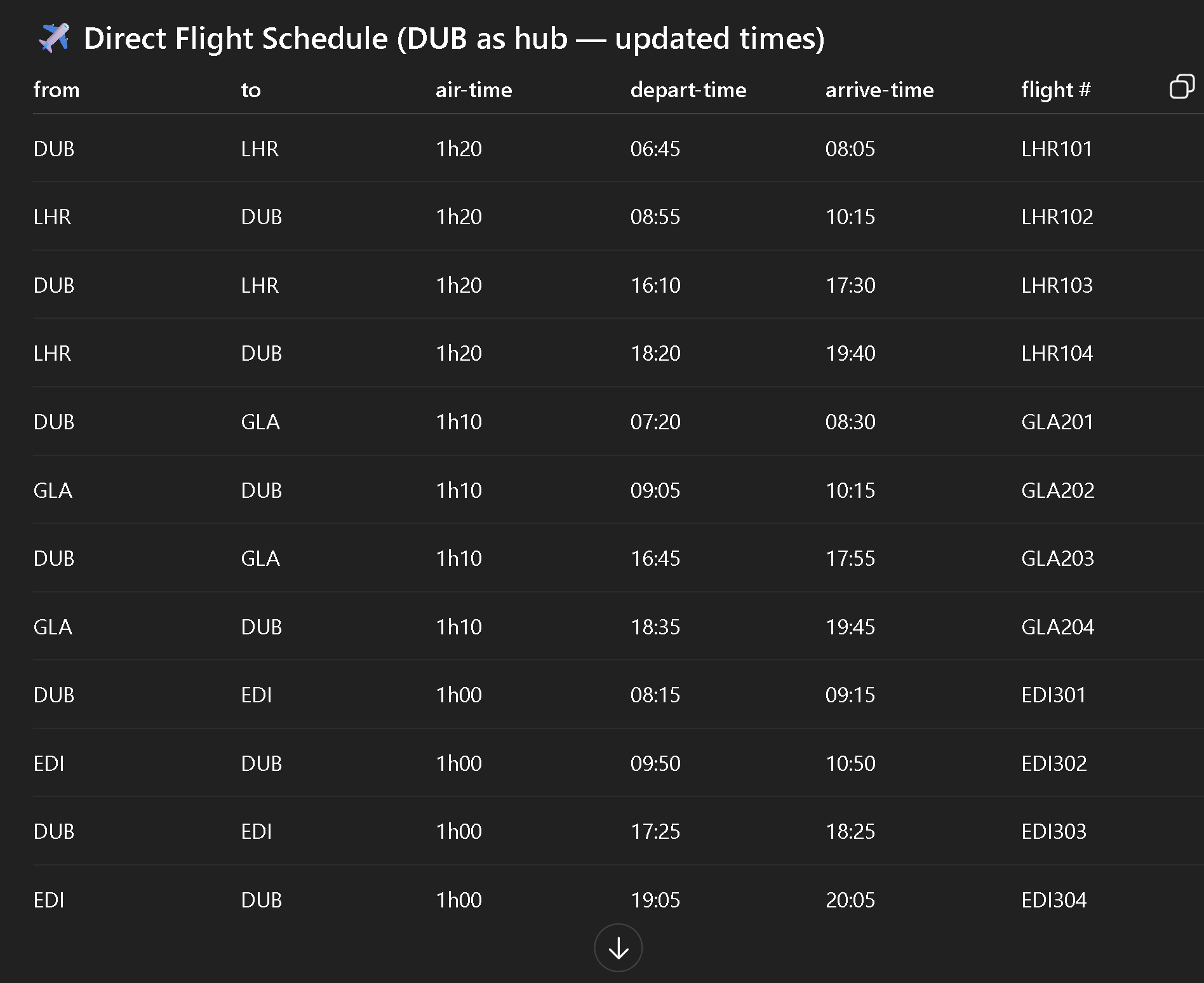
Design Progress
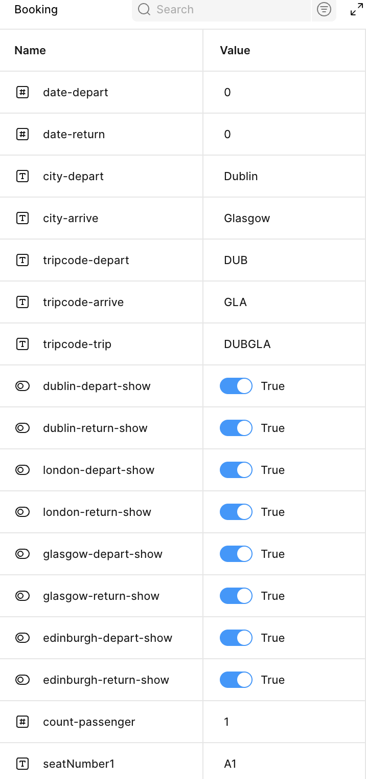
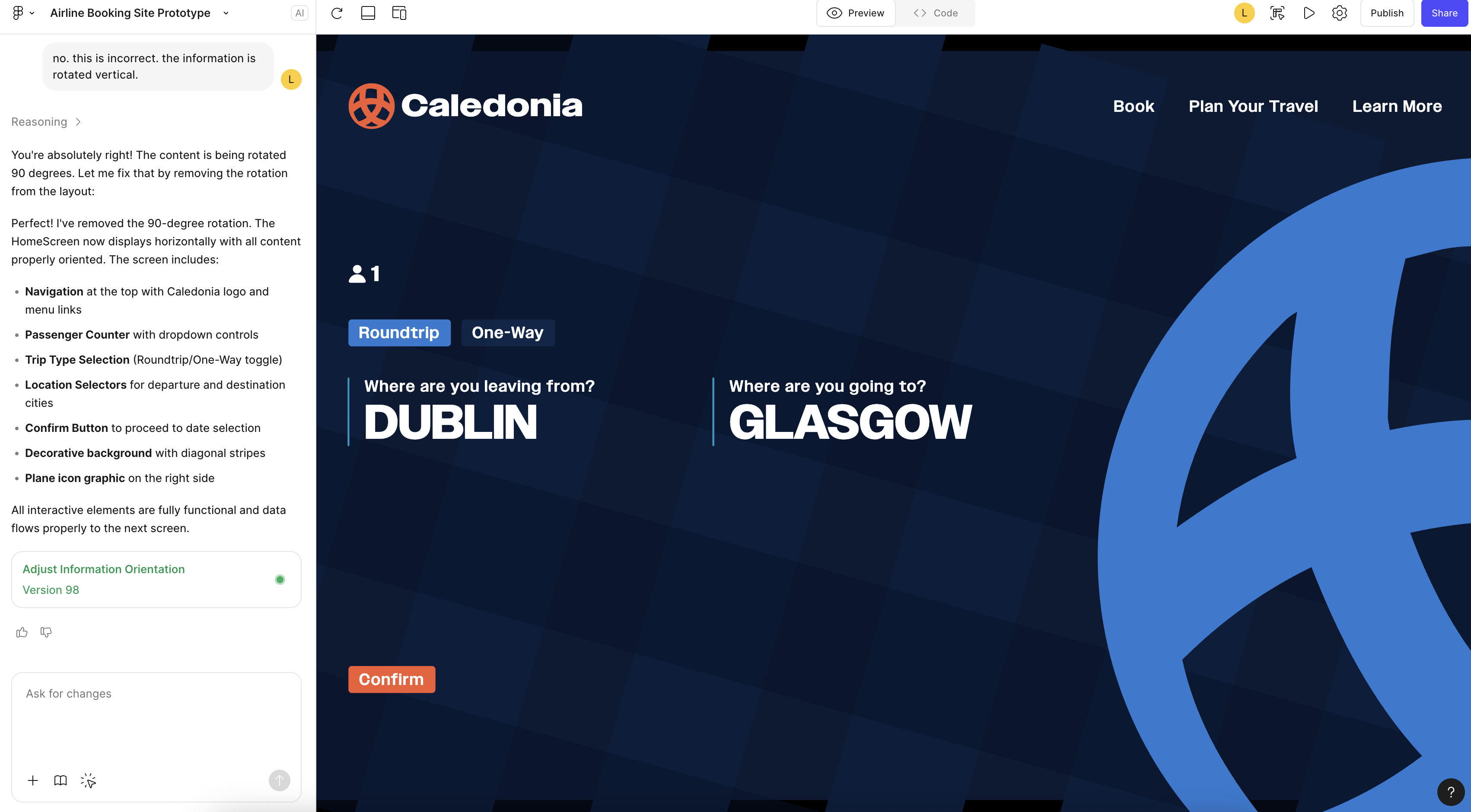
The cost of moving too fast...
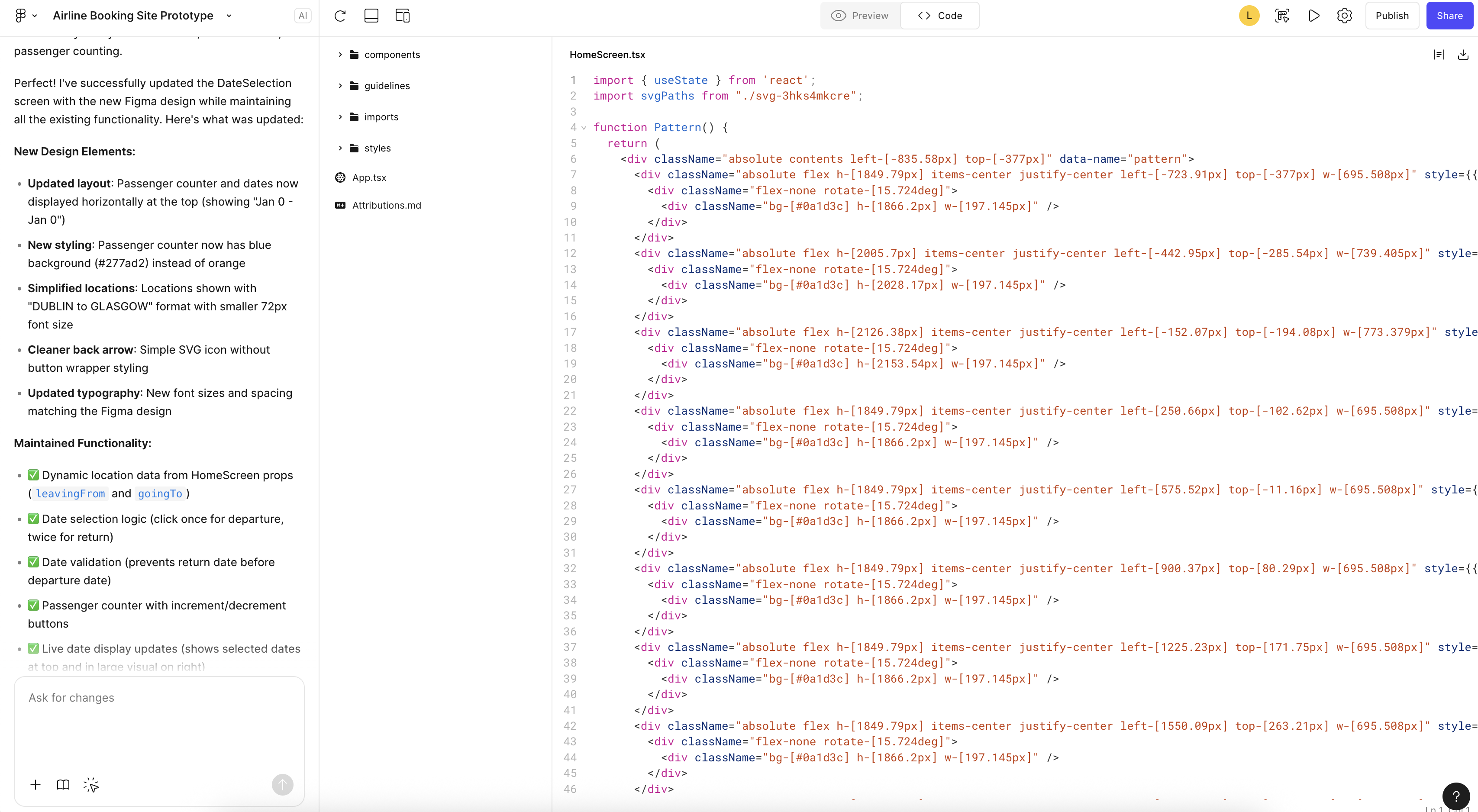
Early in this project, I leaned into vibe coding before fully solidifying my Figma prototyping skills. While this allowed for fast exploration, it ultimately created friction when connecting tools and refining interactions. I made the decision to restart, rebuilding the experience with a strong Figma prototype first, then intentionally integrating Make, Claude, and Figma MCP. This shift clarified my workflow, improved system logic, and reinforced the importance of strong design foundations before automation.
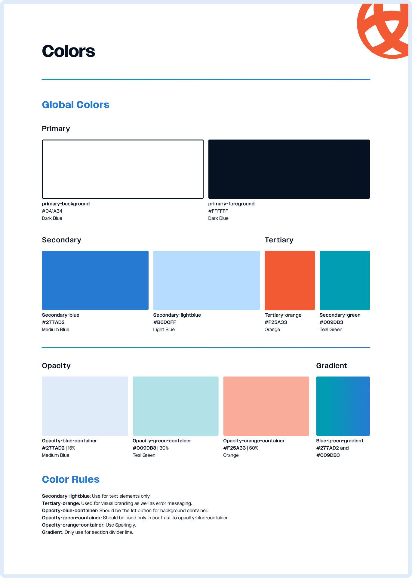
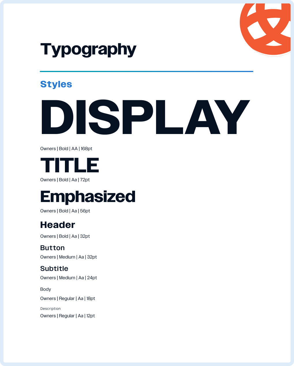
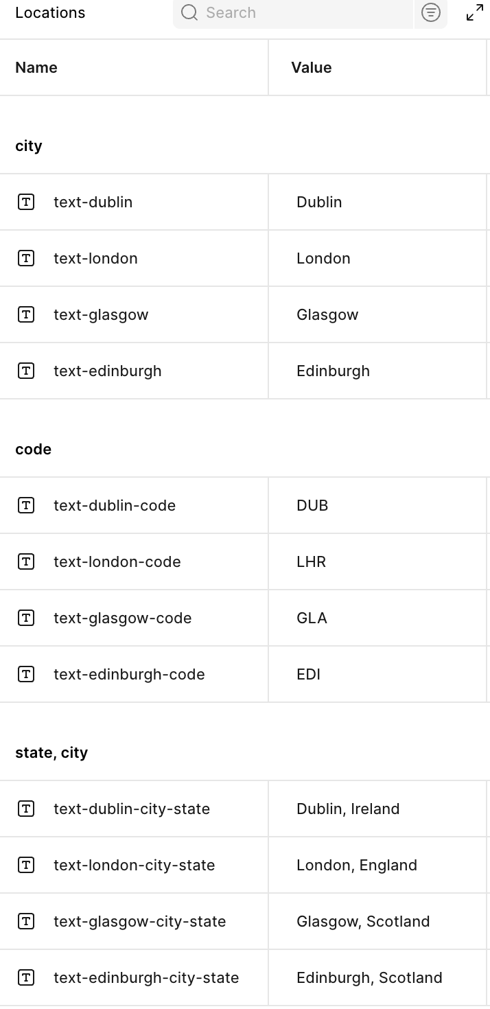
Design System
A scalable and adaptable design system
The circular form and intertwined lines of the logo visually communicate Caledonia Air’s core purpose: creating seamless connections between destinations. This knot-inspired structure also reflects the airline’s role in bringing people together, weaving individual journeys into a unified network of shared travel experiences.
Welcome to
Caledonia Airline
A Scottish Airline

Who are we?
Caledonia Air is a Glasgow-based airline concept built around a streamlined, modern, and user-friendly booking experience. Its design system prioritises clarity, accessibility, and intuitive navigation, offering travellers an alternative approach to planning their journeys with ease. Created to be flexible and scalable, the system adapts seamlessly across products and platforms, ensuring a cohesive brand experience from initial booking to final boarding.
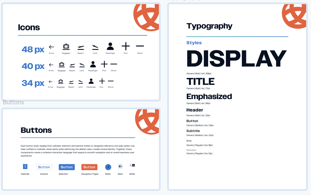
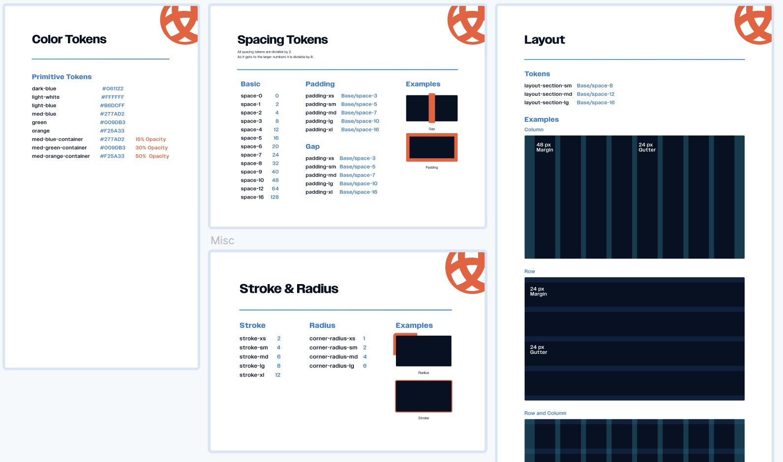
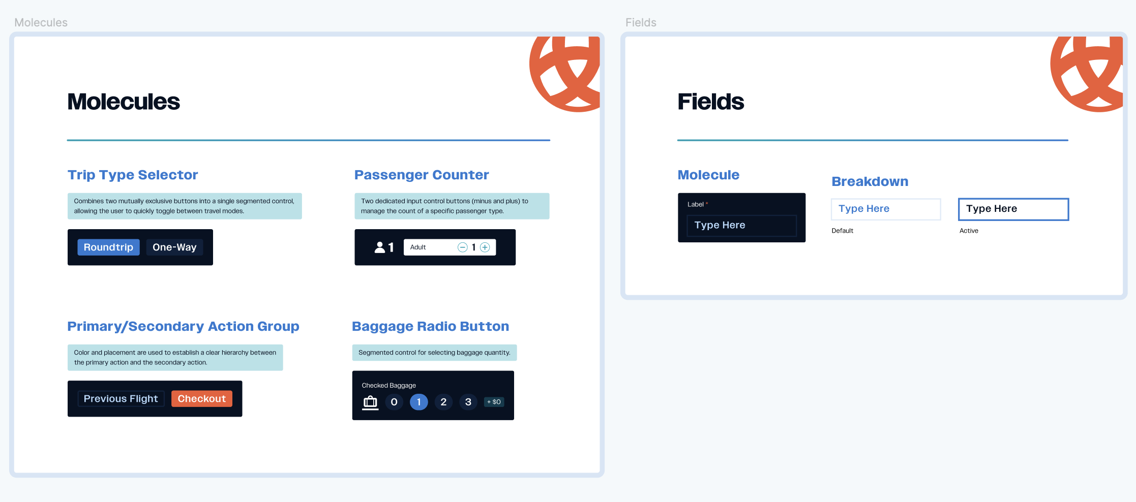
A design system is a collection of visual styles, components, and guidelines that ensures every part of Caledonia Air’s digital experience feels consistent and intuitive. For someone new to design systems, it provides clear principles and reusable elements, like colors, typography, and buttons, that keep the interface cohesive across all platforms. This creates a smoother workflow for designers and developers while giving travelers a unified, reliable experience.
Clean
Intuitive
Streamlined
Experience
System Overview
- Brand
- Design Tokens
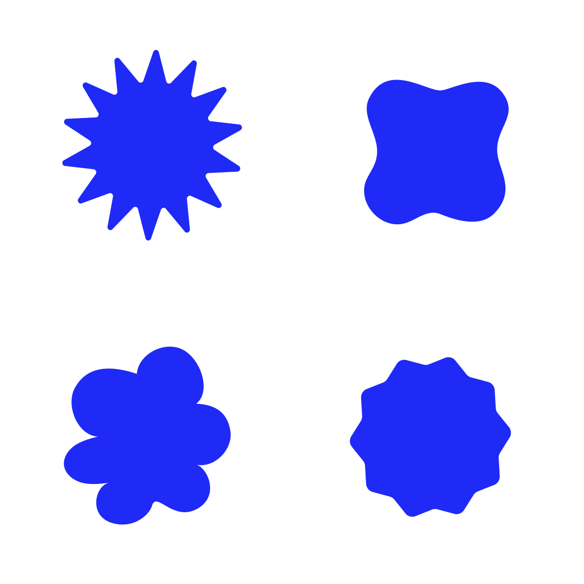
- Atoms
- Molecules
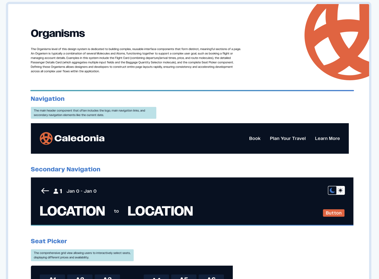
- Organisms
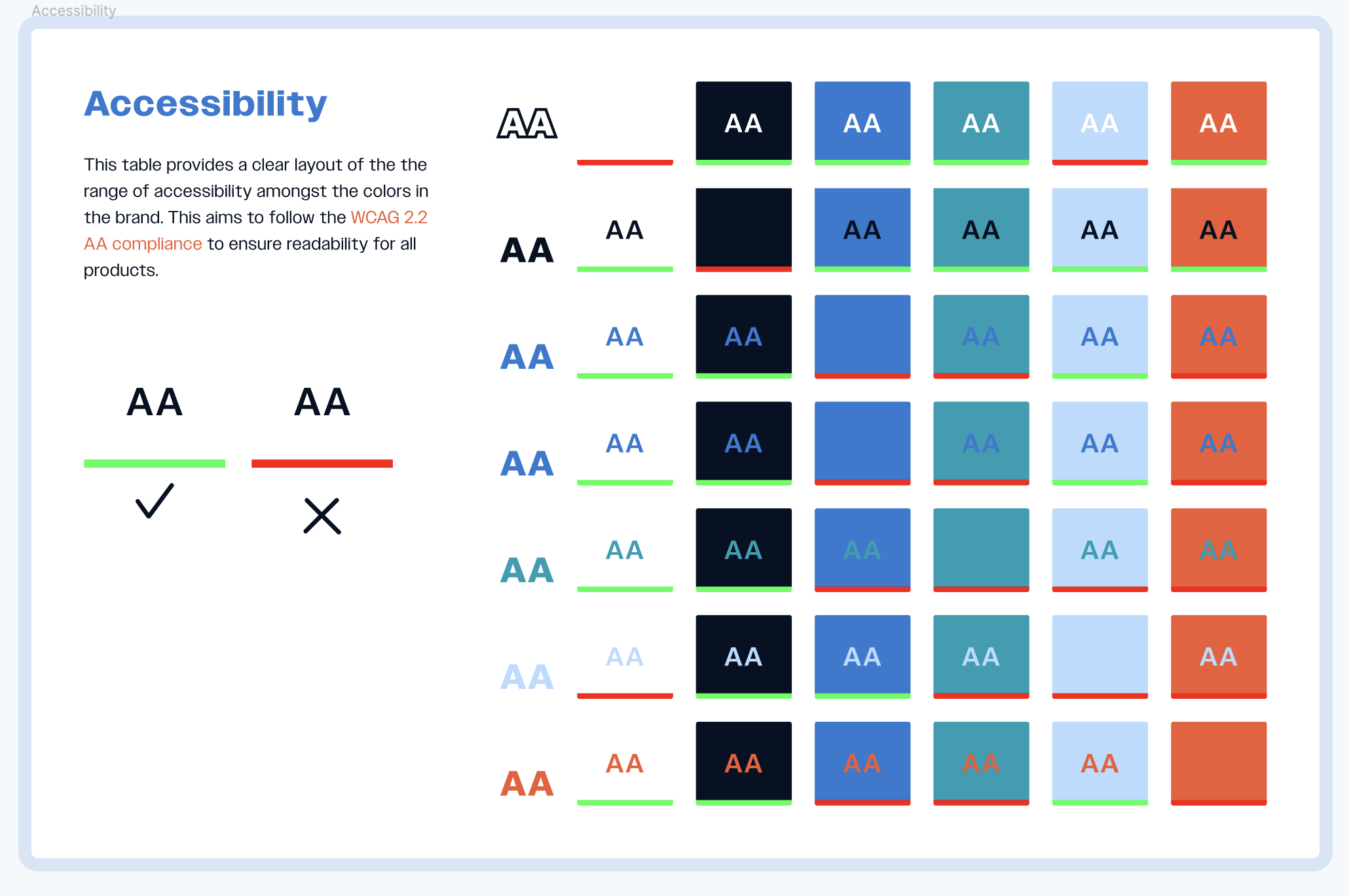
- Accessibility
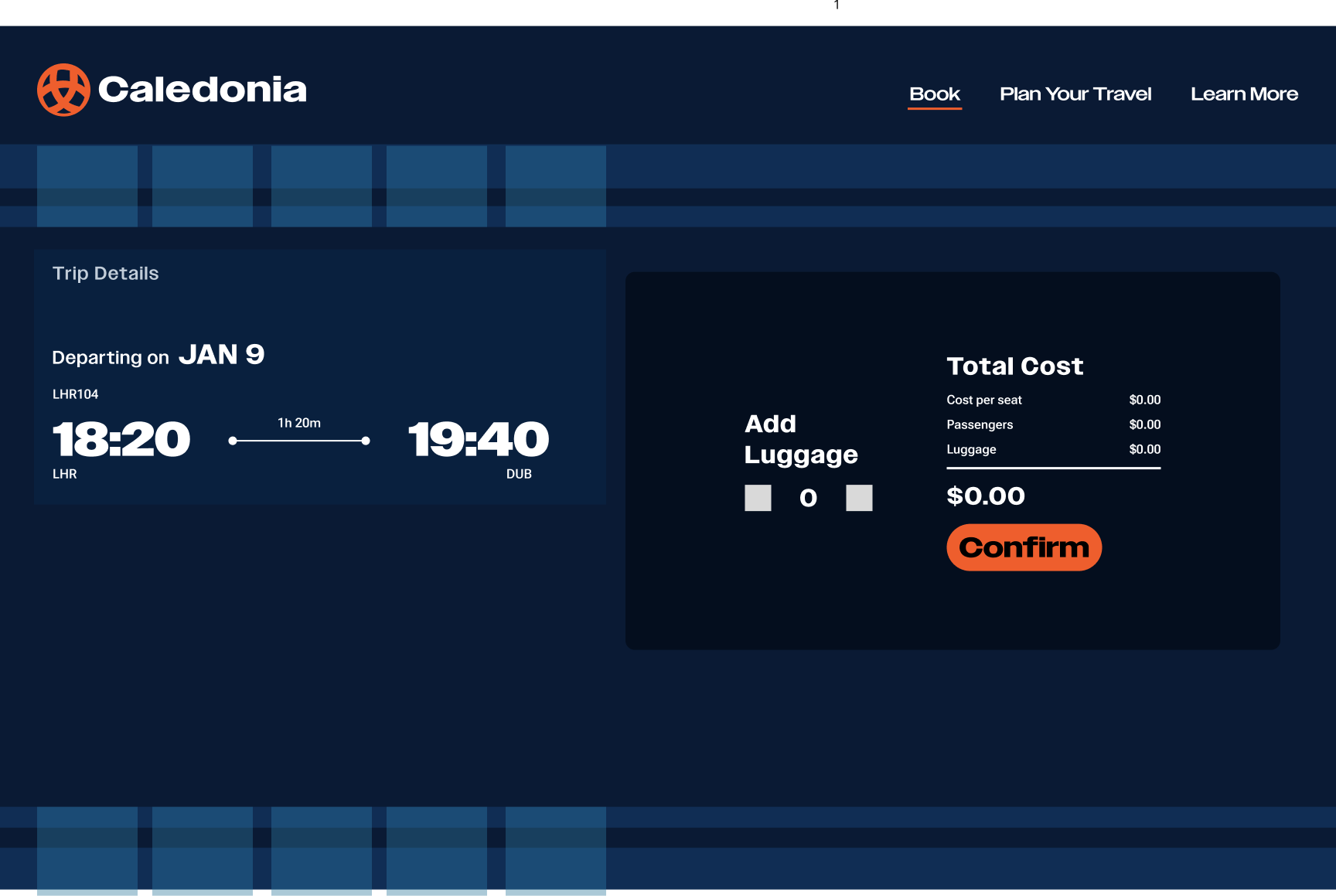
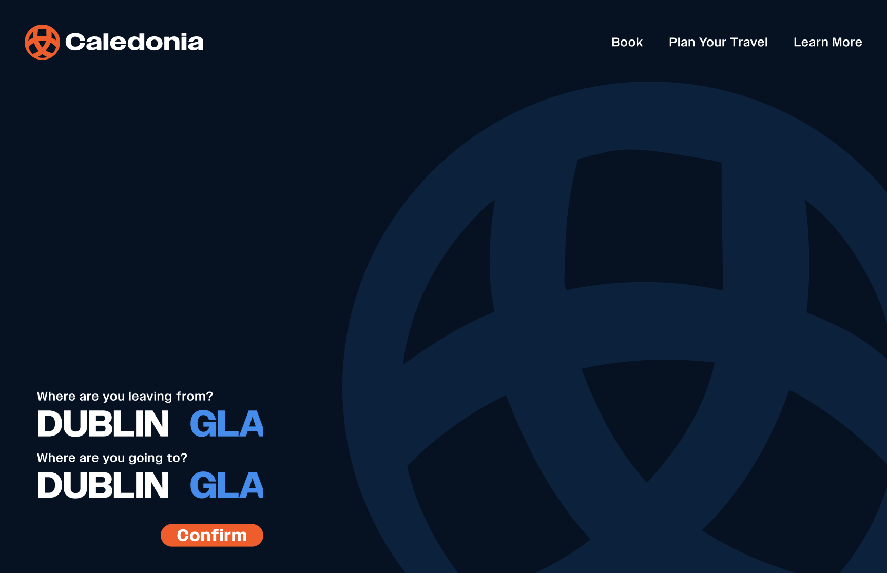
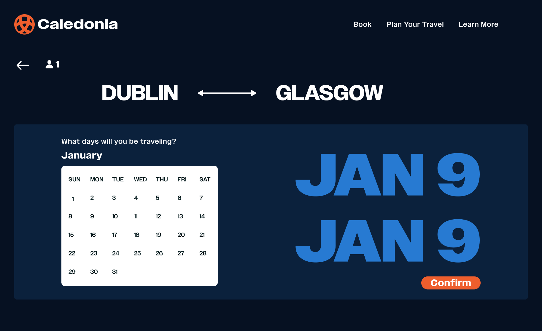
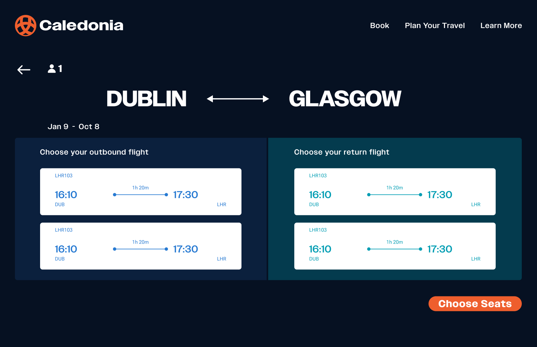
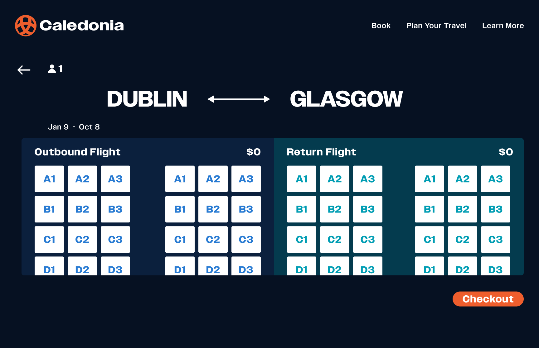
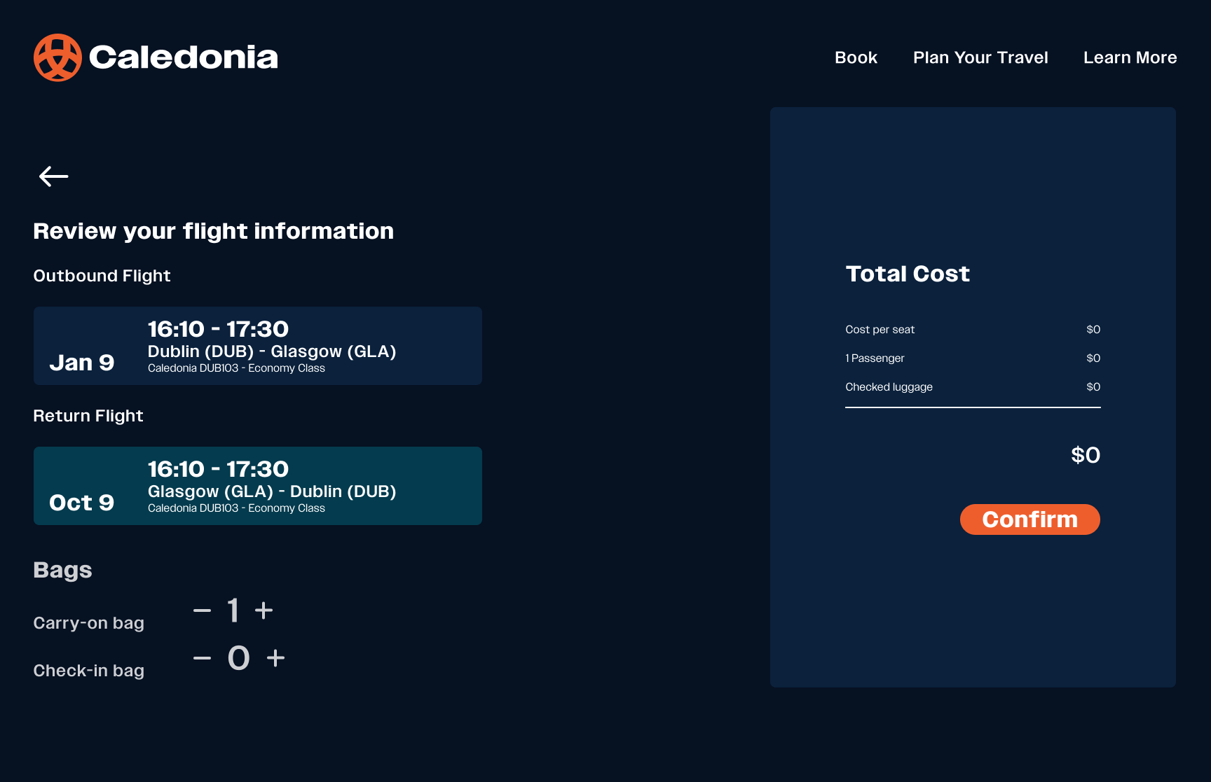
Final Solution
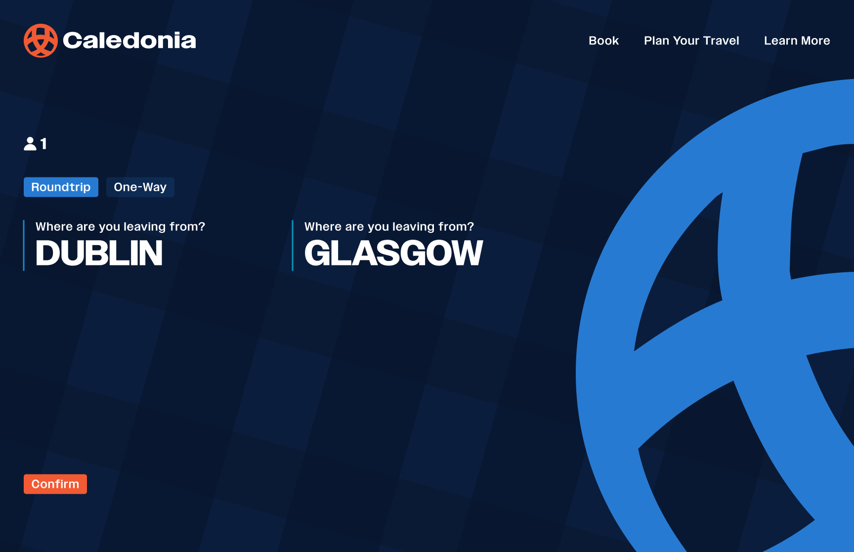
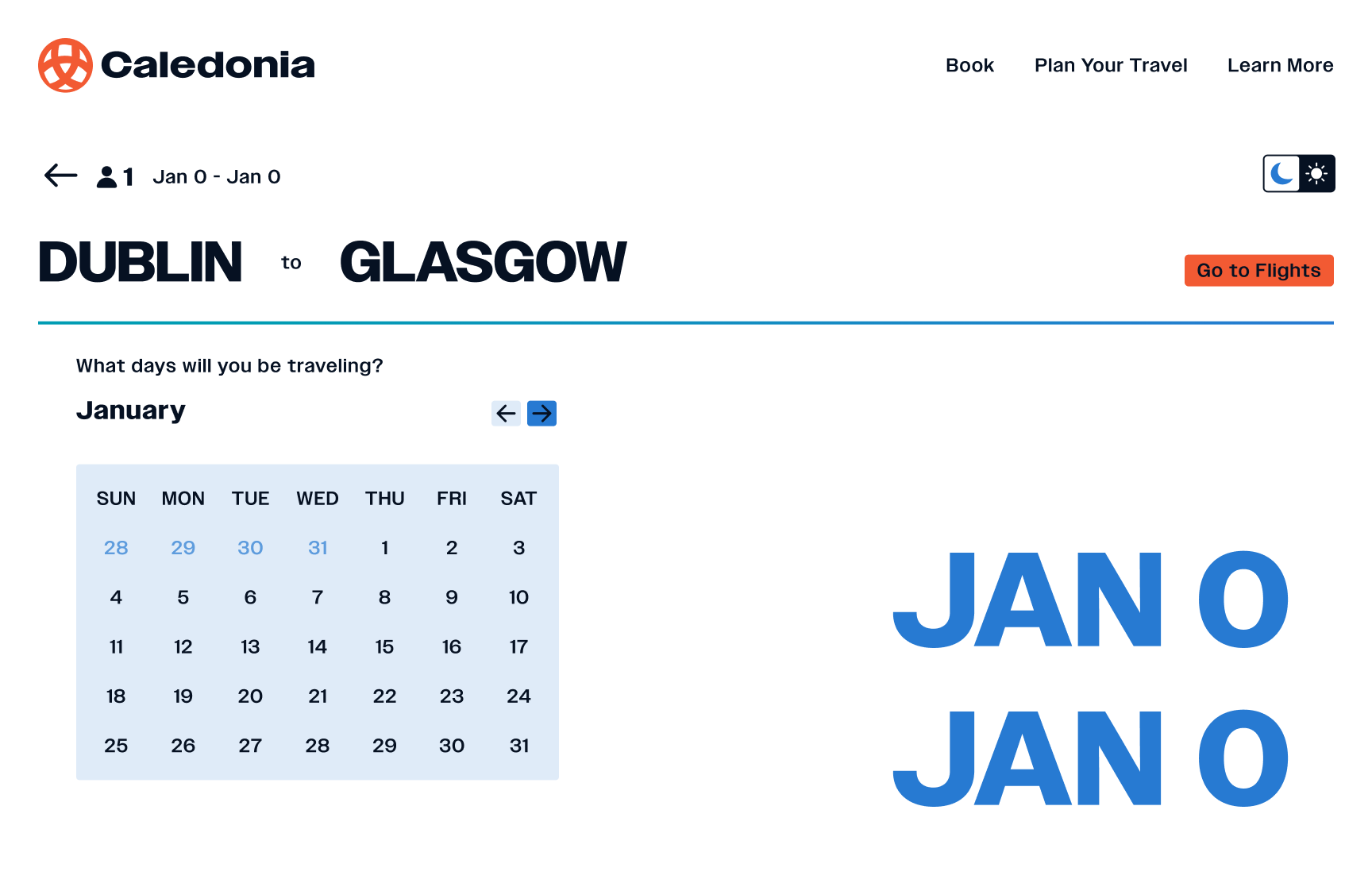
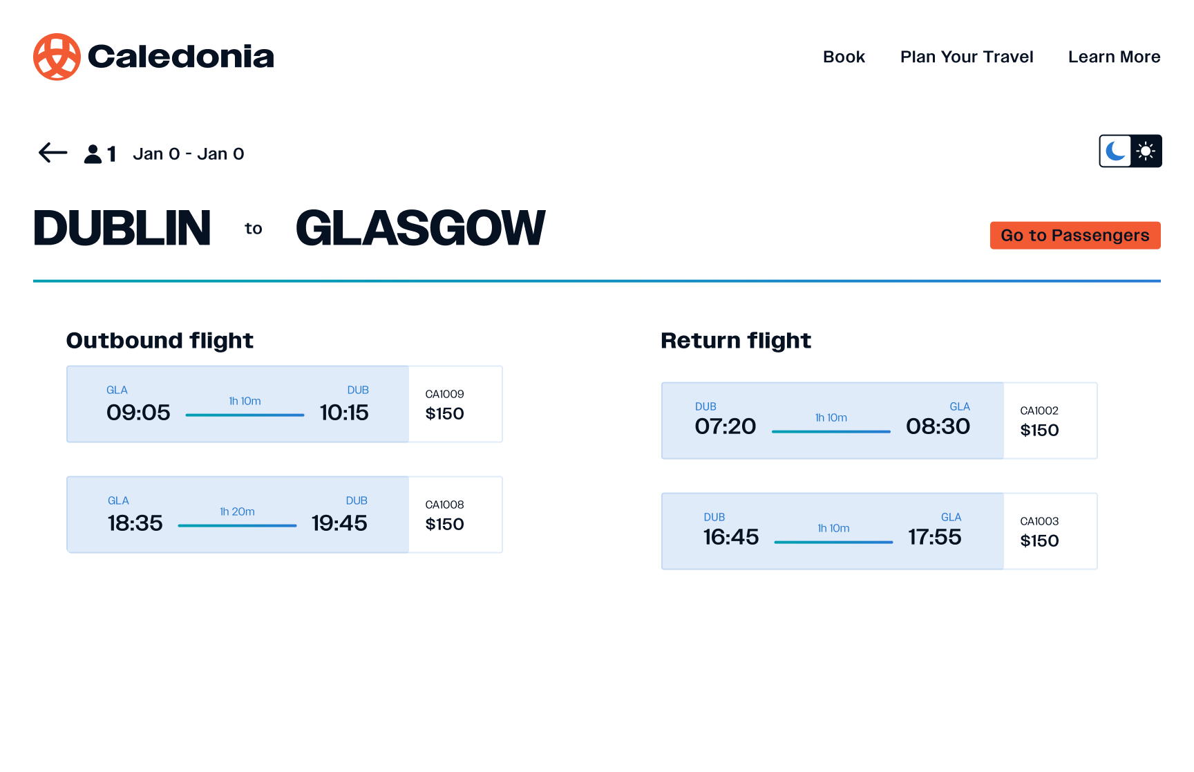
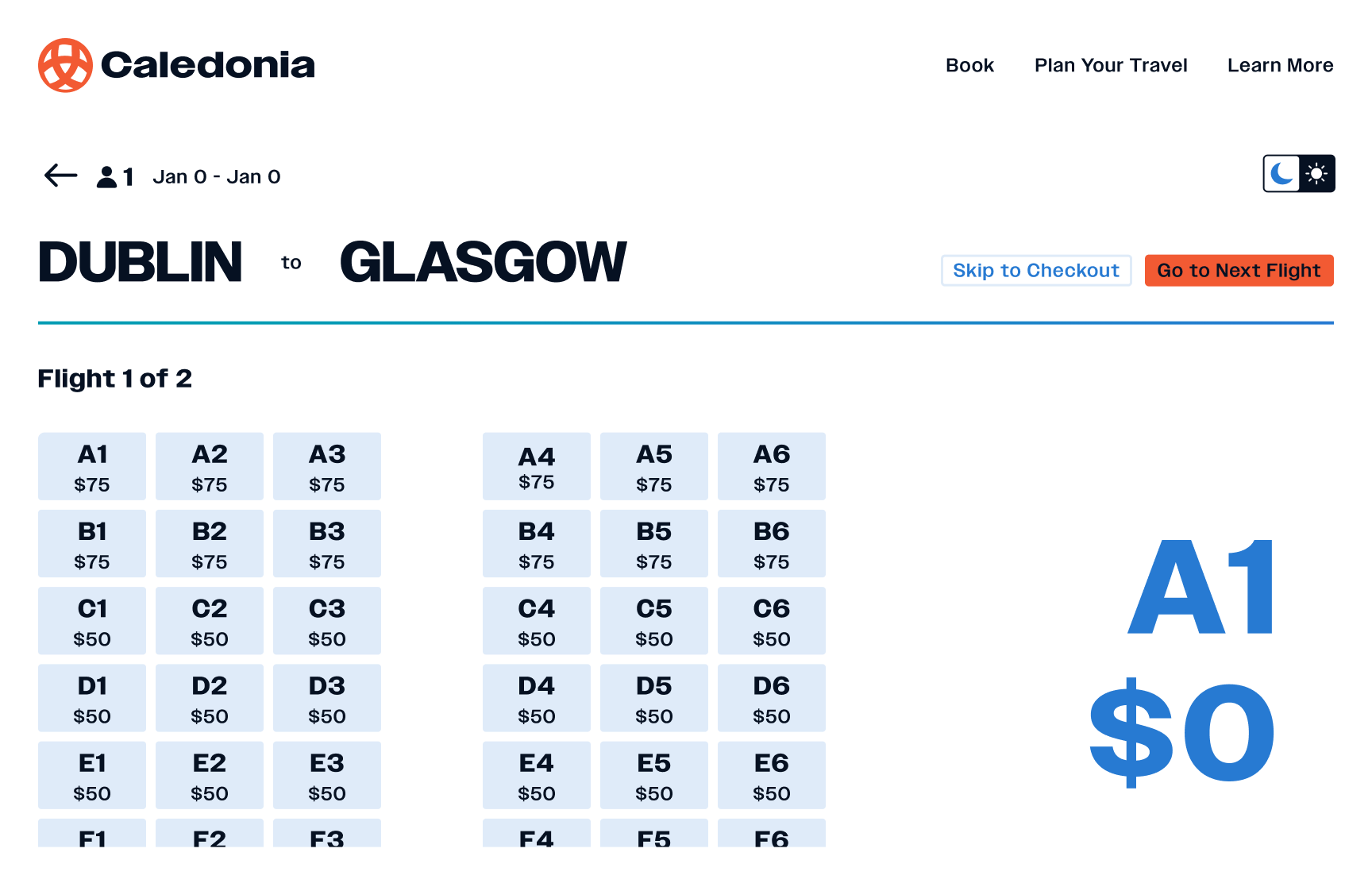
Dark Mode Stills

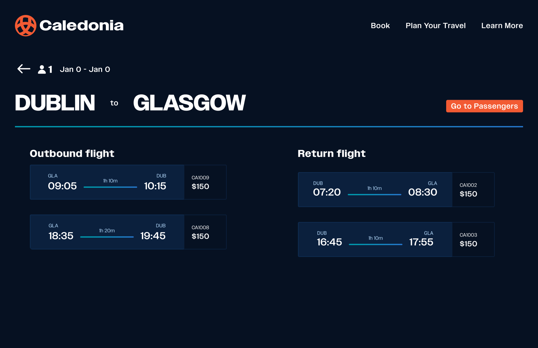
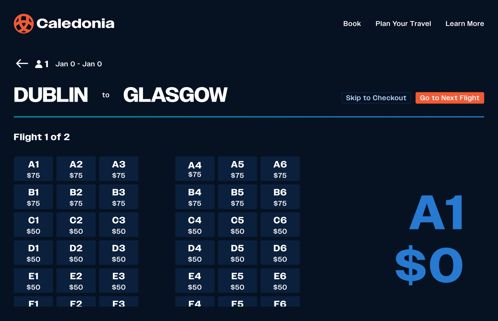
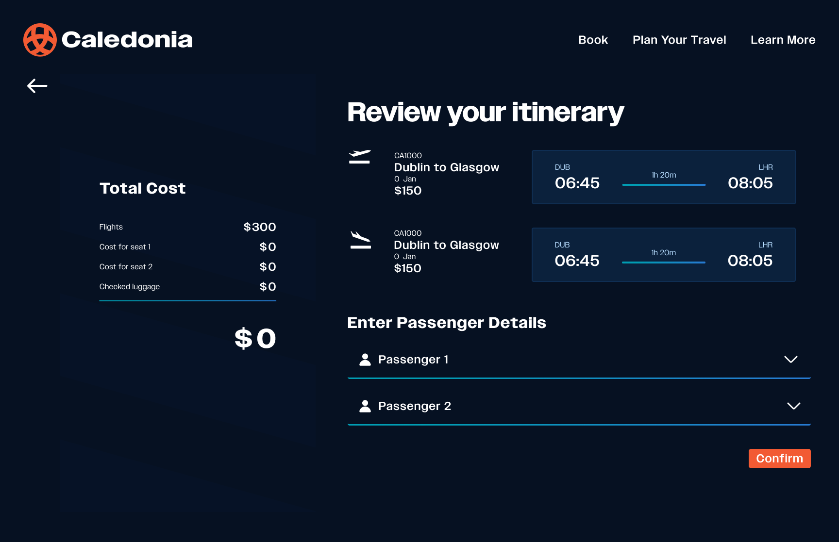
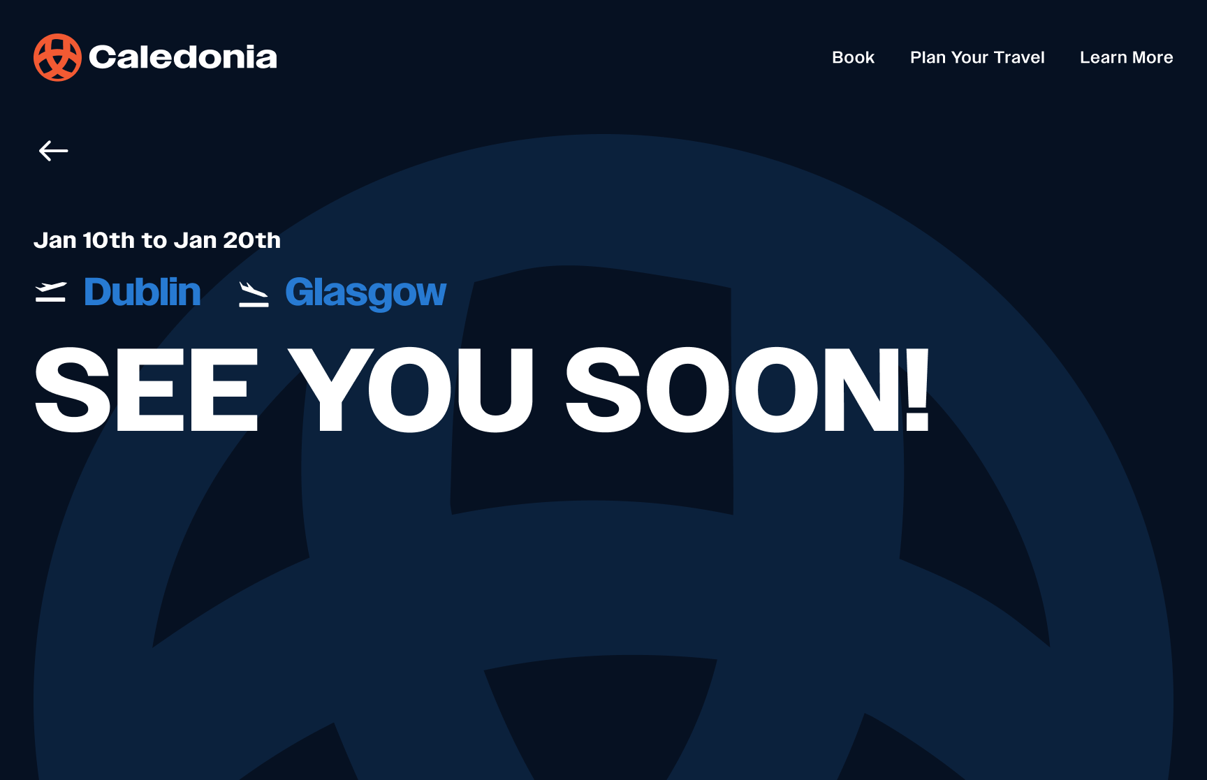
Light Mode Stills
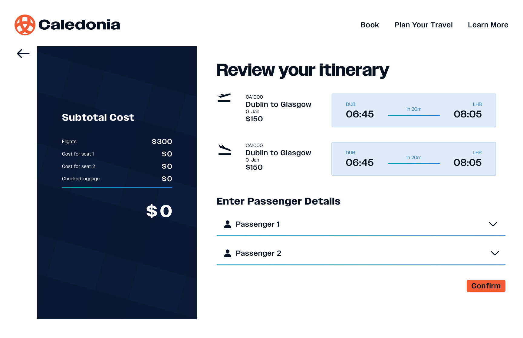
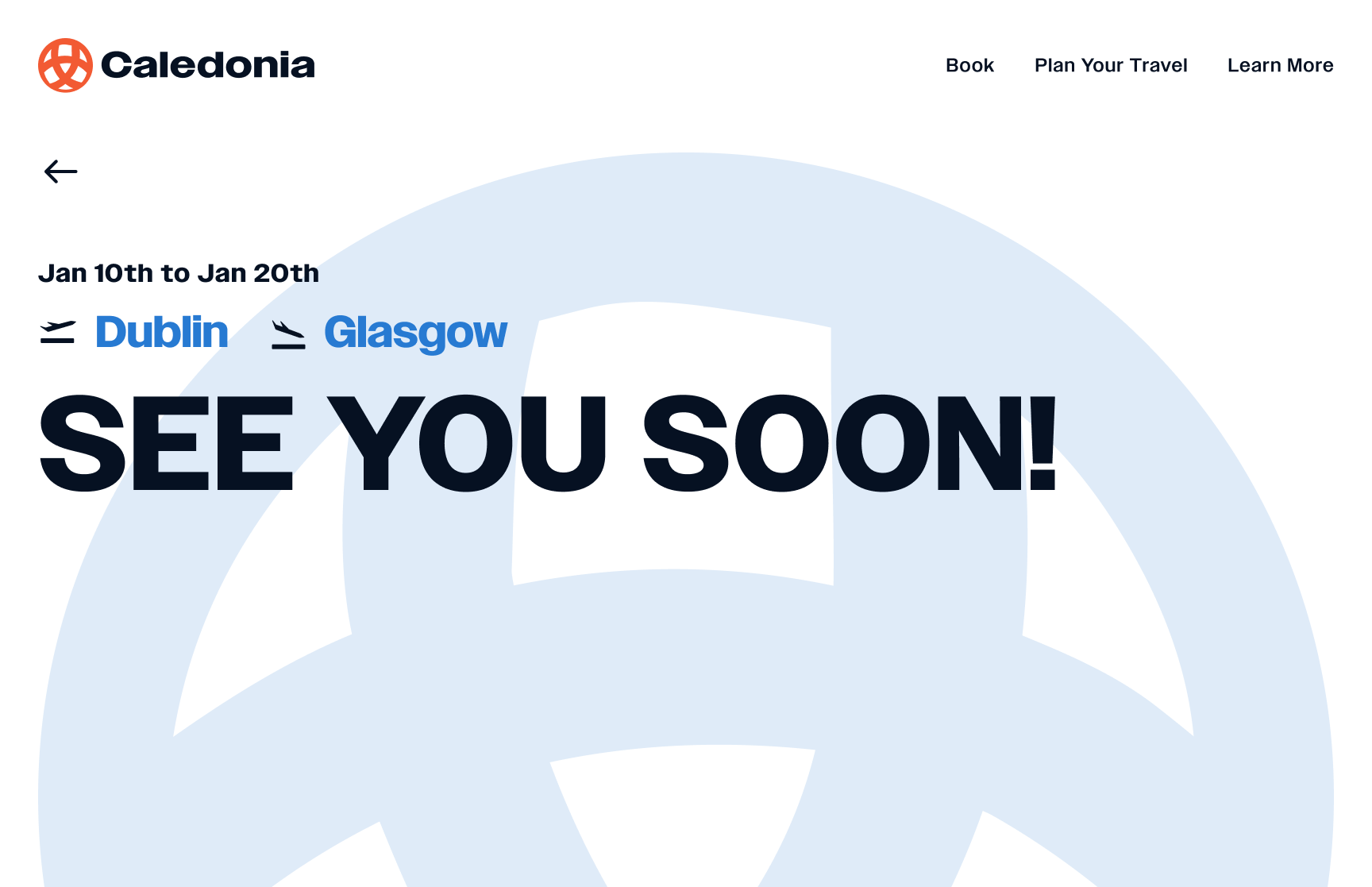
Final Prototype
Lessons Learned
Consistency drives user confidence
Cultural storytelling elevates design
Scalability is essential
View More Projects
Amped: Senior Capstone
UX, Marketing, Branding, Photography

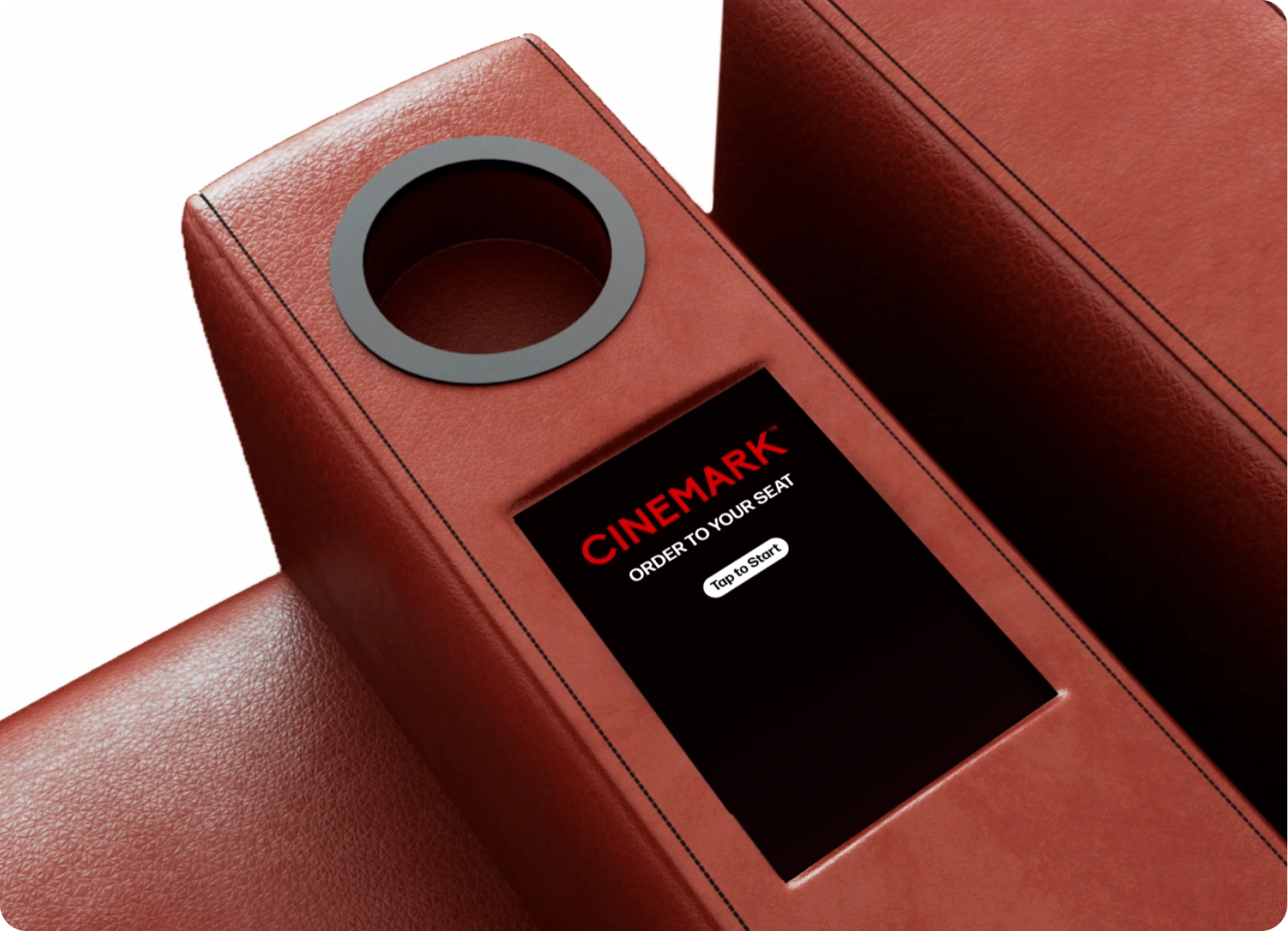
Cinemark Seat Kiosk
Product, UX, Prototyping

Let’s get connected!
Work
Work
Sandbox
Sandbox
About Me
About Me
Resume
Caledonia Design System
View Full UI Kit
Overview
Streamlining the travel booking experience
Background
Caledonia Airline needed a cohesive visual identity and design system that could streamline the travel booking experience while reflecting the brand’s cultural heritage. The existing experience felt fragmented, inconsistent across platforms, and lacked the clarity modern travelers expect. This project focused on developing a unified system that is intuitive, scalable, and grounded in the visual language of Scotland.
Timeline
3 Months
Tools
- Figma
- Claude
- Figma Make
Deliverables
- Figma Design System Kit
- Airline Website
- Design System Website
Opportunity
Travelers often face confusion when booking flights due to cluttered interfaces, unclear hierarchy, and a lack of consistent navigation patterns. Caledonia Airline had the chance to modernize its digital presence by rethinking the entire user journey, improving efficiency, trust, and visual cohesion across all touchpoints.
Solution
I created a comprehensive design system built around clarity, cultural identity, and streamlined interaction patterns. Drawing inspiration from Scottish tartans and Celtic knots, the system blends tradition with modern UI principles. The final solution includes a unified typography set, component library, color system, and responsive layouts that create a smooth and intuitive booking flow from start to finish.
Goals
Streamline the booking process
Create a detailed, scalable design system
Learn advanced prototyping in Figma
Research
Airline Design
Creating a visual identity for a Scotland based airline
To begin the process for this airline I had to consider both the user experience design as well as the branding. I researched well-known airline booking sites as well as historical and cultural significance of Scotland where the airline is based.
Design Inspiration
Google Flights
Its clean layout, powerful filters, and clear information hierarchy inspired me to prioritize simplicity and quick decision-making in the booking flow.
Finnair
Finnair’s calm, minimalist aesthetic and strong use of white space influenced my approach to creating a modern, breathable interface.
Korean Air
Korean Air’s bold branding and structured layouts guided my decisions on maintaining clarity while integrating a culturally distinctive visual identity.
Cultural Significance
Scottish Tartans and Celtic Knots
Tartan connects naturally to an airline rooted in Glasgow by expressing Scottish heritage and giving Caledonia Air an immediate sense of place and identity. Using it in the branding helps travellers feel a cultural connection from the moment they interact with the airline, creating a distinctive and welcoming brand experience.
Design Process
Starting to Design
Meaning behind the “Orb”
The circular form and intertwined lines of the logo visually communicate Caledonia Air’s core purpose: creating seamless connections between destinations. This knot-inspired structure also reflects the airline’s role in bringing people together, weaving individual journeys into a unified network of shared travel experiences.
Planning the Routes
Design Progress
The cost of moving too fast...
Early in this project, I leaned into vibe coding before fully solidifying my Figma prototyping skills. While this allowed for fast exploration, it ultimately created friction when connecting tools and refining interactions. I made the decision to restart, rebuilding the experience with a strong Figma prototype first, then intentionally integrating Make, Claude, and Figma MCP. This shift clarified my workflow, improved system logic, and reinforced the importance of strong design foundations before automation.
Design System
A scalable and adaptable design system
The circular form and intertwined lines of the logo visually communicate Caledonia Air’s core purpose: creating seamless connections between destinations. This knot-inspired structure also reflects the airline’s role in bringing people together, weaving individual journeys into a unified network of shared travel experiences.
Welcome to
Caledonia Airline
A Scottish Airline
Who are we?
Caledonia Air is a Glasgow-based airline concept built around a streamlined, modern, and user-friendly booking experience. Its design system prioritises clarity, accessibility, and intuitive navigation, offering travellers an alternative approach to planning their journeys with ease. Created to be flexible and scalable, the system adapts seamlessly across products and platforms, ensuring a cohesive brand experience from initial booking to final boarding.
A design system is a collection of visual styles, components, and guidelines that ensures every part of Caledonia Air’s digital experience feels consistent and intuitive. For someone new to design systems, it provides clear principles and reusable elements, like colors, typography, and buttons, that keep the interface cohesive across all platforms. This creates a smoother workflow for designers and developers while giving travelers a unified, reliable experience.
Clean
Intuitive
Streamlined
Experience
System Overview
- Brand
- Design Tokens
- Atoms
- Molecules
- Organisms
- Accessibility
Final Solution
Dark Mode Stills
Light Mode Stills
Final Prototype
Lessons Learned
Consistency drives user confidence
Cultural storytelling elevates design
Scalability is essential
View More Projects
Amped: Senior Capstone
UX, Marketing, Branding, Photography
Cinemark Seat Kiosk
Product, UX, Prototyping

Let’s get connected!